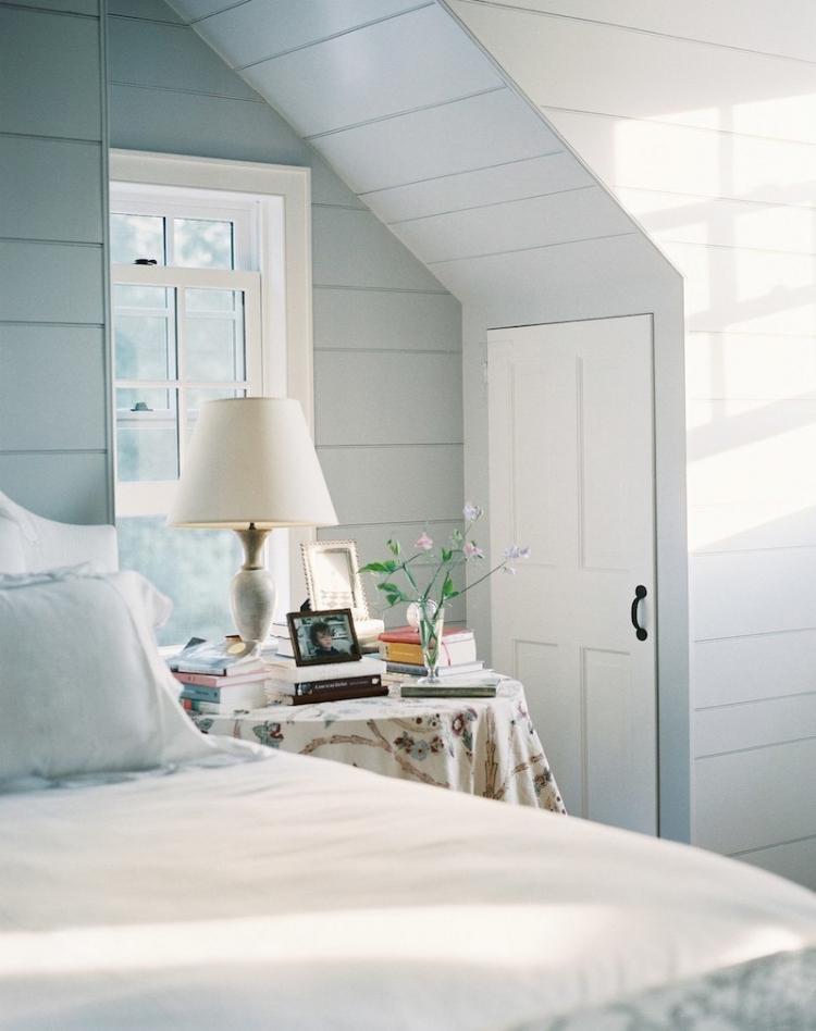
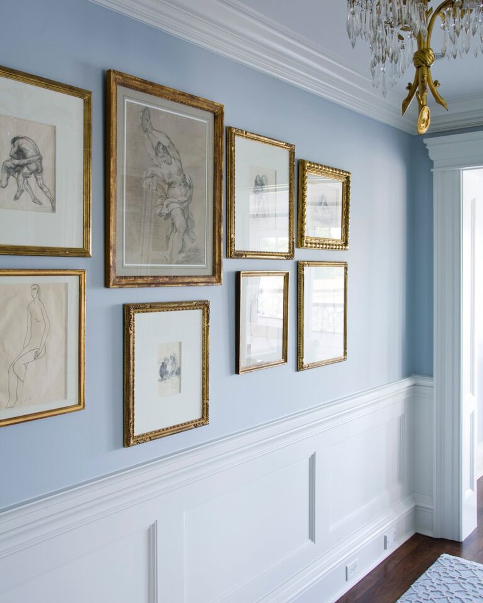
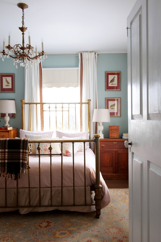
Here’s a classic curated collection of 15 rooms all painted in pale blue that are sure to inspire.
I’m very slowly planing the design of our guest bedroom. I’ve been waiting for the inspiration to come to me organically over the last few months. Our guest room in the past wasn’t a space that we were eager to finish. If I’m honest the space has served as storage more than I’d like to admit. In the occasion that we do have an over-night guest I make a mad dash to get it clean and clutter-free. We’re finally at a place where we can put our attention into and make it into something beautiful and inviting.
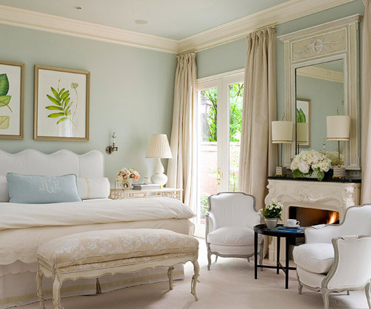
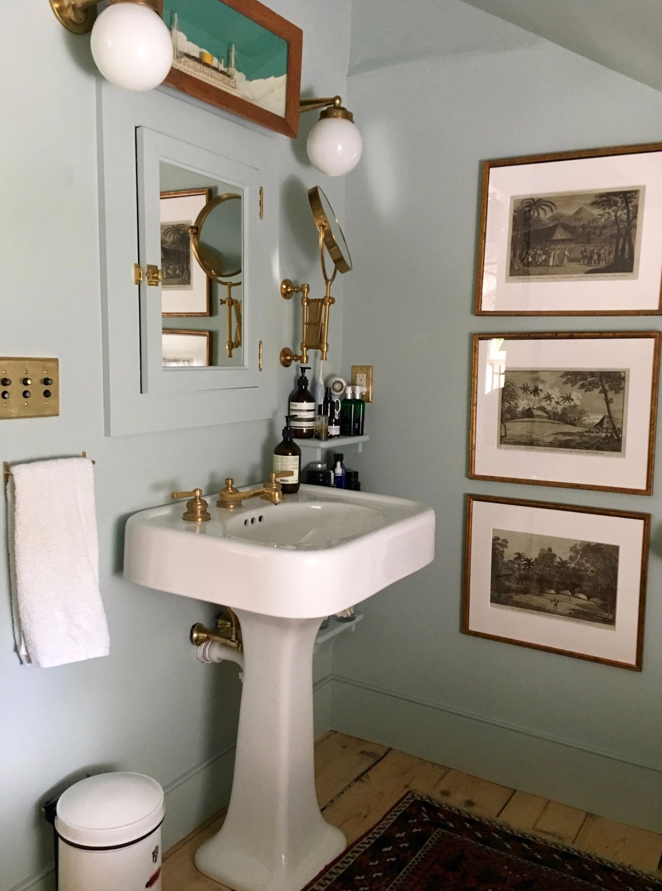
Lately I’ve been very inspired by serene paint colors such as soft greens and pale blues. I’ve always gravitated towards them in decorating and have always thought that blue is a great neutral yet gives a room a calm feel with a slight pop of color. Today I’ve put together 15 spaces that all use the pale blue color beautifully! I’m going to do the same for rooms painted in soft green over the next couple of weeks before I make my finally decision. I can’t wait to get a complete design created for our guest room but as work on it over the next couple of months I’ll share my ideas with you as they come.
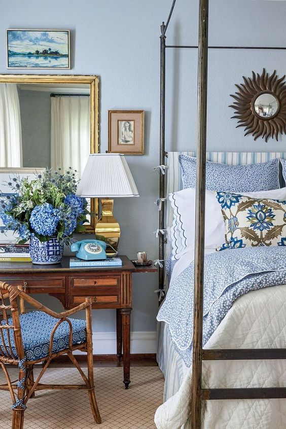
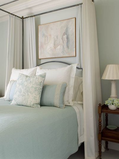
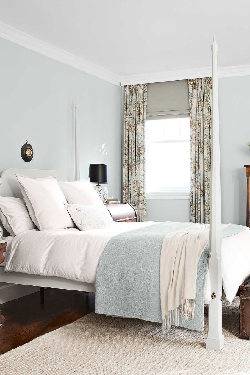
Here’s are 15 rooms painted in blue that have me completely inspired –
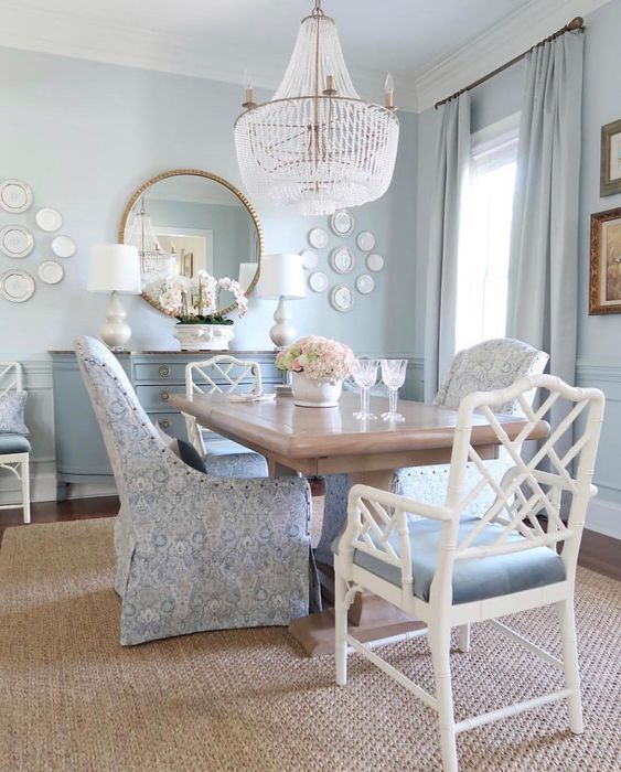
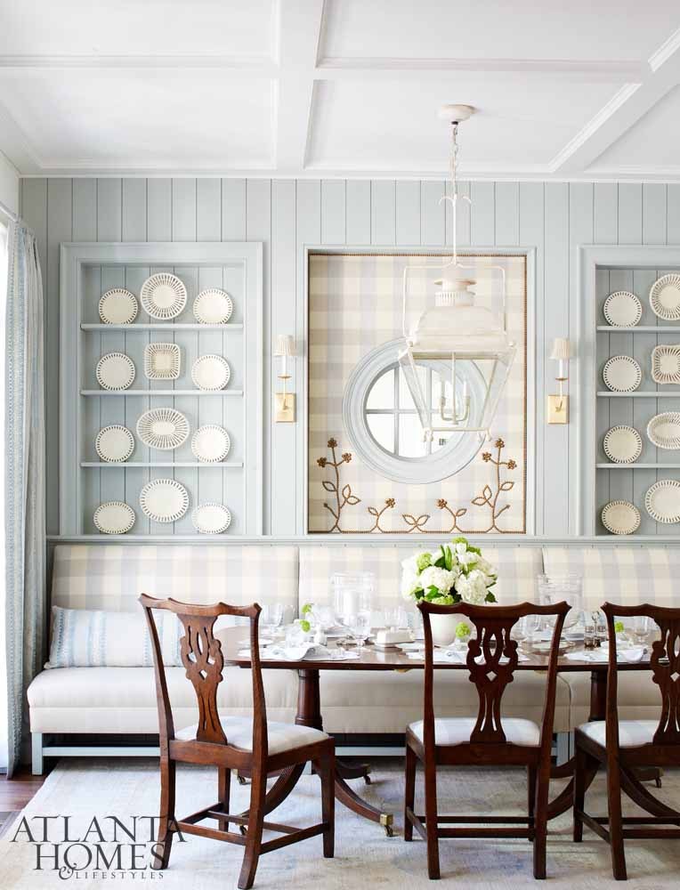
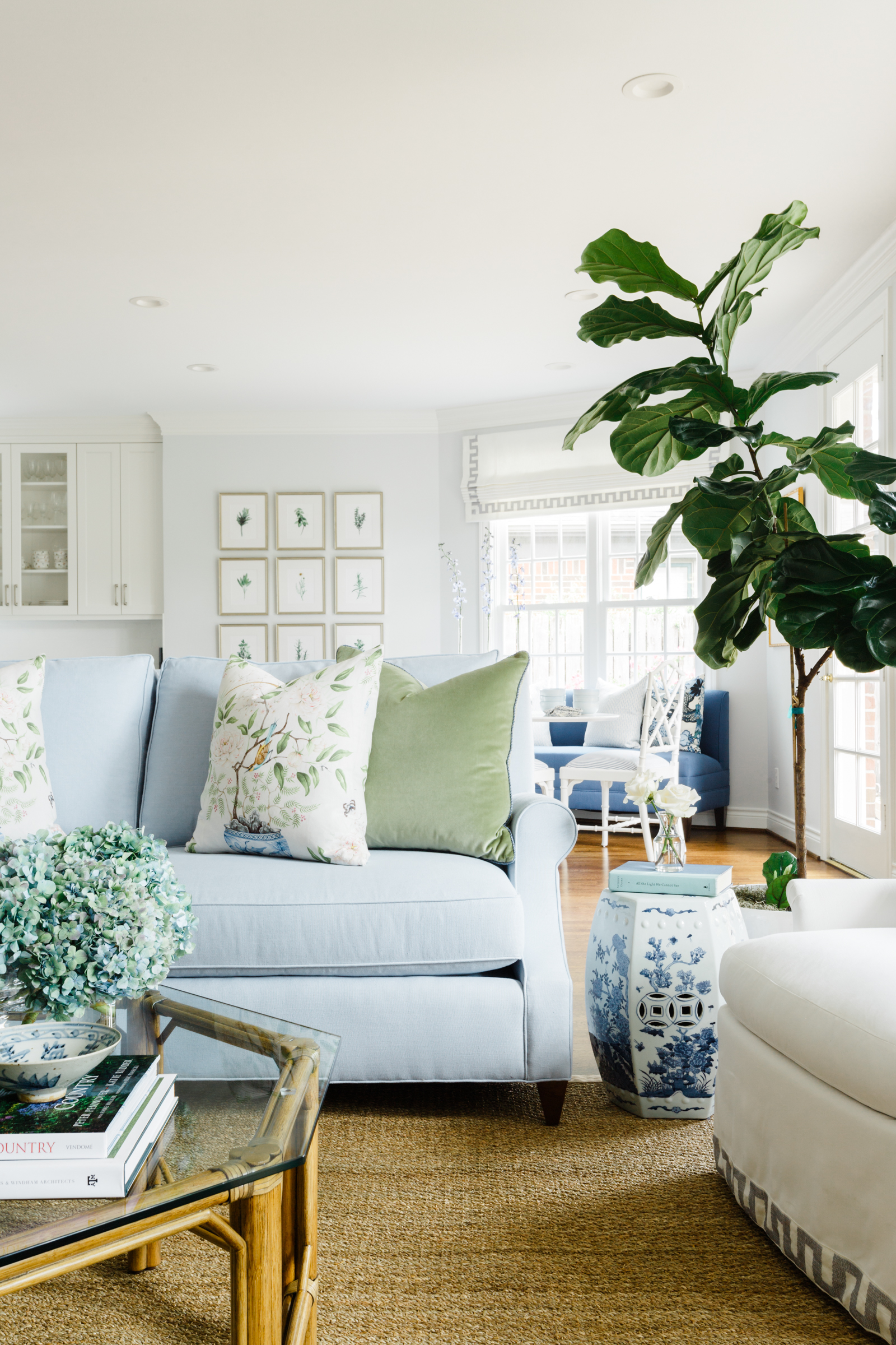
I’ve had this dining room saved for as long as I can remember. I love it’s use of soft colors mixed with check fabrics and rich wood tones. It’s completely serene.
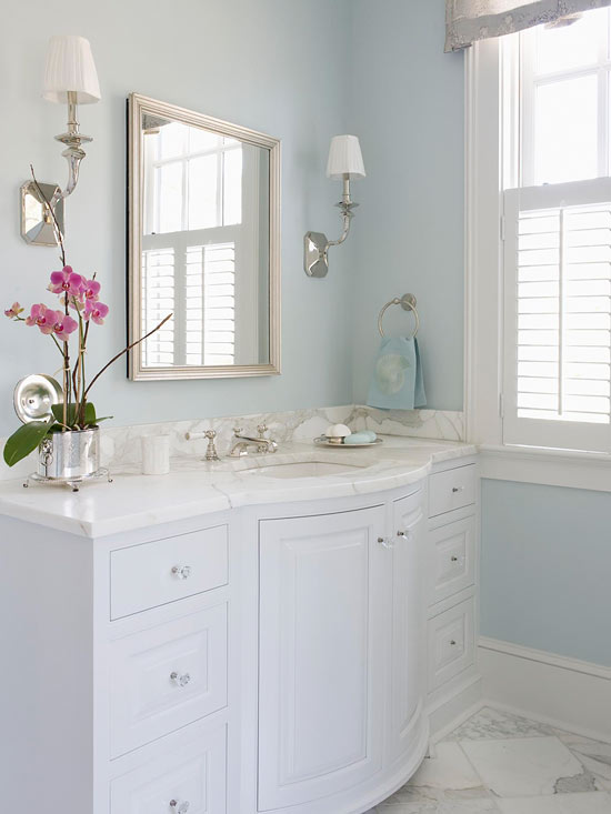
I love pale blue not just on the wall but also on cabinetry. It was a color that I considered when we painted our kitchen cabinets.
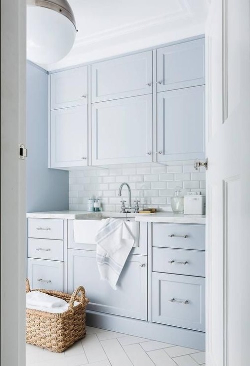
I also love colors that are a mix of blue and green. Depending on the time of the day our kitchen cabinets can appear more blue or more green. I love that!
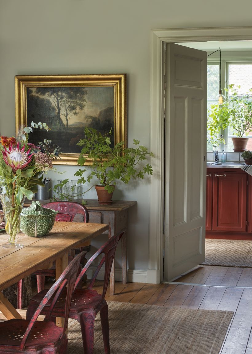
Blue dining room with plants – Source

I don’t have any exact paint colors in mind just yet. There are so many pretty options. I came across this article by Laurel Bern Interiors on 12 mistakes that people make when picking a paint color not too long ago and I love her tips. The last thing you want to do is pick the wrong shade and have to paint your space not once but twice. I’ve done this more than I care to admit.
If you have a favorite shade of blue I’d love to know what it is! If you’re in the same boat as me I hope these pretty blue rooms inspired you too. I find some much inspiration in timeless spaces and I love to getting to share it with you!


I like pale blue as well. Recently updated bathroom with pale pale blue walls and whit cabinets along with a bit of backsplash tile very close to wall color. Used quartz countertop similar to Carter’s tile. I love it. Quicksilver by Sherwin Williams. Front hallway (2 story) is also same color along with upstairs bathroom. Next two shades are used in living and dining room. I’m going to paint master bath in either quicksilver or next color down. It is soothing and makes art work pop.
I too love pale blue. I had a blue guest bedroom in our previous home for over 25 year and it was the only room in which the color was never changed. Everyone that stayed in that room loved it and would comment how serene it was. It was Benjamin Moore Misty Blue, with the ceiling, same color only at 50% tint. The large crown was BM Ivory white (which may not be as clean/crisp as many want now). So we have recently moved to a new, small house and I NEEDED a light blue room and for our Master bed and bath I chose Benjamin Moore Glass Slipper. It has a high peaked ceiling so I did the ceiling and walls the same color. It is east facing, so in the morning light it is so calming and ethereal I never want to leave!!! I also painted the cabinets in the laundry room the same color (higher sheen) and it is equally sigh worthy!!!! Awwwwwwww.
Sounds awesome! We just did our living room pale blue but I don’t know the exact color because we lightened it up a lot. The shade we bought was darker- well -bluer-than we expected.
It was too “kid’s day care” when we tested it. Now it’s lovely.
These rooms are lovely, just the inspiration I was looking for. I once had a beautiful bedroom done in Silversage from RH. We loved the serenity of the watery blue-green walls, white bedding and pistachio accents. After a decade of vibrant coral and chartreuse bedding on a background of silvery gray, we are ready to return to soft and romantic. I am going to pick up samples of the colors suggested in the other comments here and start painting swatches!