I recently realized that I haven’t share my favorite interior paint colors with you. I’ve shared the colors we chose for our home in the beginning, but I’ve never given you a list of my favorites paint colors we’ve used so far. Colors can appear very differently from one room to the next, depending on lighting. I hope this might give you a good starting point to finding your favorite colors!
As most of you know, we’ve have been renovating our colonial for the last five years. We love neutral, yet warm and cozy colors that work well with the historical feel of our home. You’ll find soft neutrals with pops of color throughout our home.
Our Favorite Interior Paint Colors
Swiss Coffee by Benjamin Moore
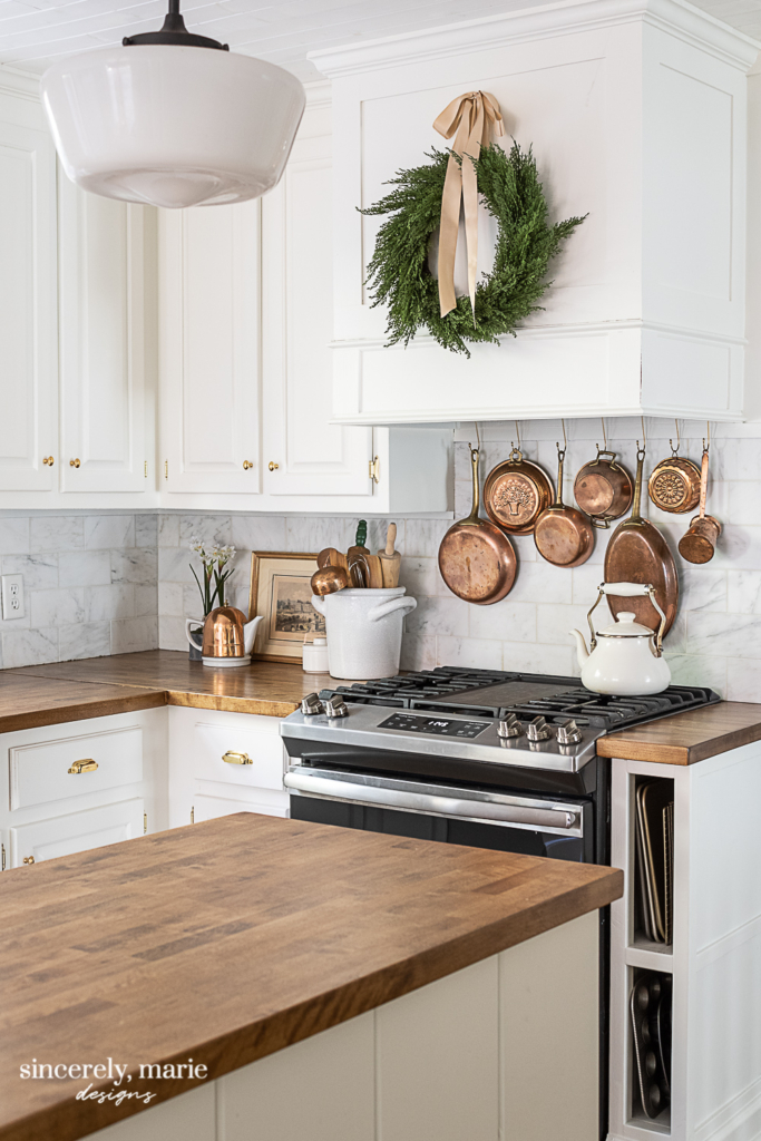
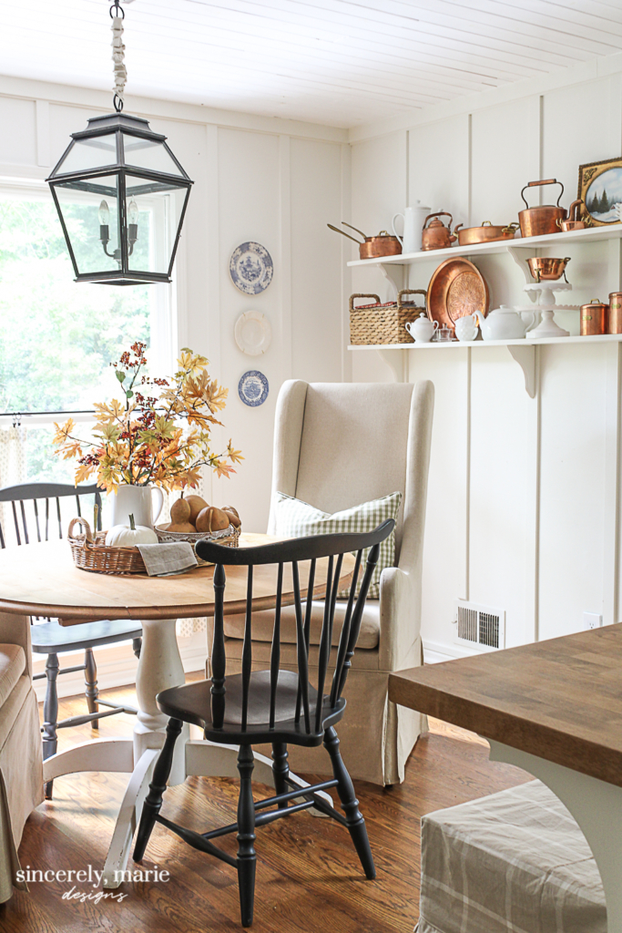
Swiss Coffee has been a popular color for some time, but it’s a new favorite of mine. It’s is a warm, creamy white. I recently chose it for our kitchen walls, trim, cabinetry and planked ceiling. It works beautifully in spaces that get low sun light and have lots of warm woods to play off of. Keep in mind, Swiss Coffee can take on a pink undertone in certain lighting. I found this to be true in my dining room, where there is much more natural lighting, so always sample first. However, its name does fit it perfectly, because in the right space, it’s the coziest white!
Simply White by Benjamin Moore
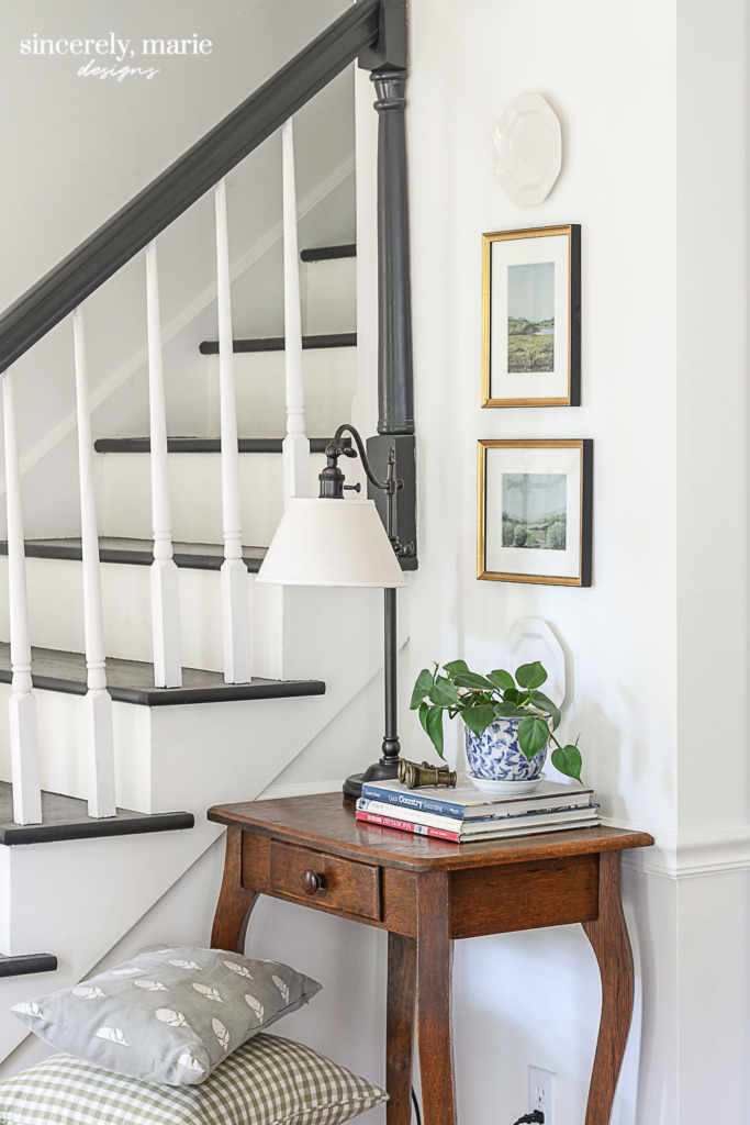
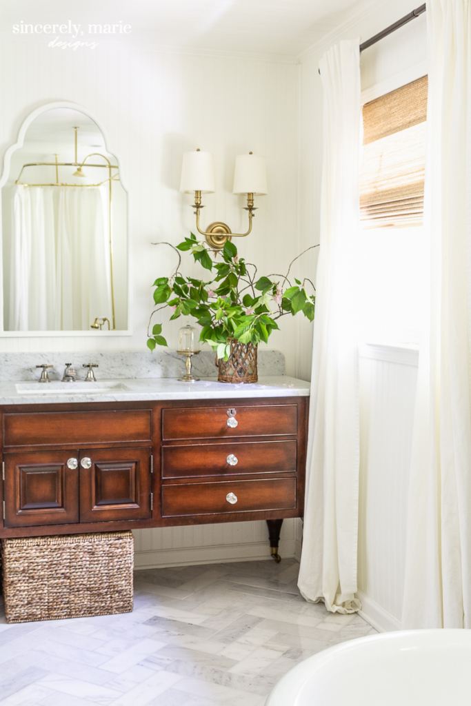
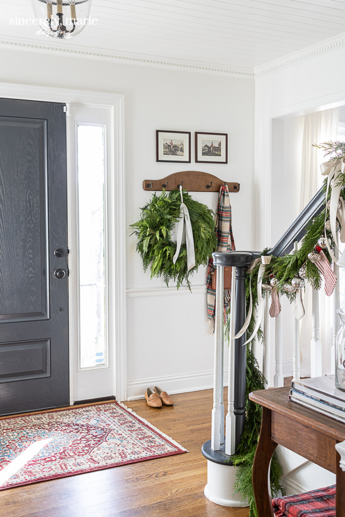
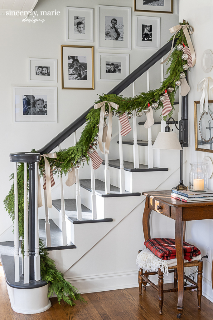
Simply White is one of my all-time favorite paint colors. It can be used for walls, trim, ceilings and cabinetry. It’s a beautiful white with a nice warm undertone. We chose this cheerful and welcoming color for our foyer, family room, my office and our master bathroom. We used it on the trim in these spaces as well as the walls for a tone on tone look. This color can also take on a pink undertone in certain spaces, so test first.
Our foyer is flooded with sunlight, so Simply White appears bright and crisp. I love how it gives the natural wood tones and gold décor in the space the spot light.
It also comes across very crisp and clean in our upstairs guest bathroom. It makes for the perfect trim and ceiling color for this small bathroom.
In our family room and master bathroom, it takes on a warmer tone due to less natural light. It really makes the space feel cozy and lived in.
Navajo White by Benjamin Moore
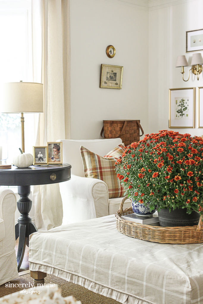
I love Navajo White! If you’re looking for an off-white that’s lighter than beige and that isn’t too sterile, this is a wonderful color. I chose it for our two fireplace mantels in our living room and dining room. It’s a warm color that pairs with Simply White beautifully. I’m currently considering it for my entire dining room, because it’s such an sophisticated color. It has a historic look to it that really gives a warm feel to a room. Beware, it can take on a peachy tone in certain spaces, so I wouldn’t say this color is for everyone.

Svelte Sage by Sherwin Williams
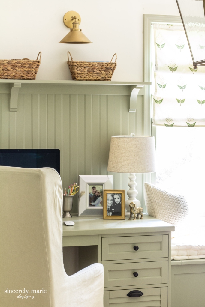
This is one of my all-time favorite shades of green! I chose it for the trim and built-in desk and window seat for my newly renovated office. It’s a soft classic for trim and cabinetry. It fits our colonial home’s style perfectly. It’s a very friendly, inviting color and pairs with my Simply White walls very well. My office gets great natural lighting, so the color takes on a soft green with a slight beige undertone. However, I have seen this color look very beige in other spaces, so I wont suggest this color for every space.
Calke Green by Farrow & Ball
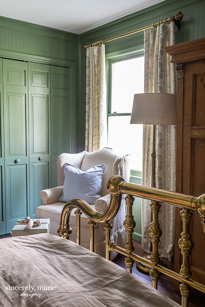
As you probably know for my décor, I’m a big fan of green. I’ve used different shades of it throughout our past and current home. One of the newest greens I’ve used is Calke Green. Last year I chose it for our guest bedroom. It has quickly become a favorite of mine! It’s a traditional, rich green that has given our guest bedroom so much warmth. I love the English feel to this color and just how well it compliments the brass items in this room. I would be beautiful in a study or mudroom. I don’t know that I would use it in a large space, because it is a very rich color.
Graphite by Benjamin Moore
Years ago I chose Graphite for our interior doors and staircase bannister & treads. I wanted a darker, dusty color that wasn’t too harsh and cold. This color fit my requirements perfectly. It works well with our neutral wall colors and doesn’t show up grim like a lighter color would on our doors. It can take on a navy color in certain lighting, so just keep that in mind. It hasn’t bothered us one bit.
There are so many beautiful colors out there. I’m currently looking at a few dusty blues that I plan on using on Charlie’s bedroom trim. Décor & fabrics in blue and green have always been my favorite, but I’ve been gravitating towards blue and green paint colors lately as well. That’s the great thing about paint, it as the power to completely change the feel of a space. As you and your family change, so should the walls in your home.
If you’ve been looking for a shade for a space in your home, I hope maybe one of these jumped out at you. Sometimes all we need is a spark of inspiration to put us on the right track to finding the perfect color. If you have a favorite paint color, please share below! It’s always great to find new colors. Have a wonderful weekend, friends!


Beautiful colors! What sheen do you use for walls, trim, and ceiling? When it’s all the same color, do you use the same sheen?